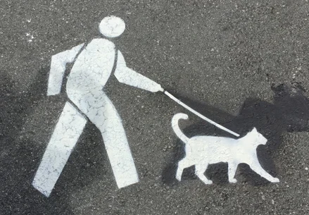
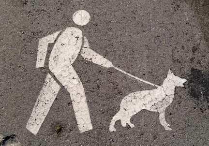
The dogs of Duboce Park

Snoopy is a recent addition

Snoopy is a recent addition

Duboce Park is a much beloved San Francisco dog park and is host to the annual “DogFest” in the spring. It is here where Harvey Milk “accidentally” stepped in dog doo in a staged TV news event to draw attention to his “pooper scooper” law. And it’s here where you can see all sizes of canines compete for Frisbees and attention in a large grassy area about the size of a football field.

But not all areas of the park are for running free. Several years ago the Parks and Rec Department painted signs on the sidewalk intended to inform dog owners that their dog must be on a leash. I walk through the park every day and noticed that a week later the sidewalk dogs were “updated” by stencil artists to look different. Then, they were painted back to the original standard-looking dog.  Then, once again, creatively updated. Then painted back. This went on for months until Parks and Rec apparently gave up. Today, there are no signs of the original artwork, but I did get a photo early on, which you can see below.

The original dog no longer exists. You can see someone once gave this dog a talk bubble.

The original dog no longer exists. You can see someone once gave this dog a talk bubble.

Ahead of a trend

He's not looking at her. She's not wearing marsala.

My friend Robb and I have a field day and geek out together every time the Pantone corporation releases their new “color of the year.” For those unfamiliar, the good people at Pantone are THE color experts for designers, and their Pantone Matching System (a different kind of PMS) is the industry standard for designers to ensure consistent color across various media. Their “color of the year” celebrates current color trends and forecasts which color will be that year’s color to remember. Well, it’s good branding for them, and it’s a fun way to cement their prominence in all things color-related. It’s also just a tad ridiculous. Mostly, because this all-important announcement is rolled out with a PR blitz and self-aggrandizing media tour reminiscent of Time’s “Person of the Year.” And also because, rather than the boring and efficient numbers that designers know from their color matching system (PMS 1817 is the color of the Jettoe logo, for example), Pantone assigns “fun” words and phrases to their colors of the year. This year’s color(s) of the year are “Rose Quartz” and “Serenity,” for example. It’s a bit of a cop out on behalf of Pantone, that they couldn’t narrow it down to just one. (Has Time ever chosen two “Persons of the Year?”) Anyway, I was thinking of this recently because Robb was appalled by the choice for 2015, “Marsala,” (née Pantone 18-1438) which Pantone describes as “a naturally robust and earthy wine red.” Pantone goes on to say that, “marsala enriches our minds, bodies and souls,” and that “this tasteful hue embodies the satisfying richness of a fulfilling meal while its grounding red-brown roots emanate a sophisticated, natural earthiness.” (C’mon, you kinda have to laugh.) Well, I, for one, love it. It’s a color that I wear all the time. And if you’re wondering if I have a point, it’s that “marsala” is scarily close to the aforementioned Pantone 1817, the color of Jettoe, although 1817 is darker. It’s a color, I might add, I chose to represent me ten years ago in 2006. So now I wonder, is it so super trendy that in a few years it may look dated? I hope not. If so maybe I’ll choose another color, maybe a dark blue Pantone might call, “Worried Witching Hour" or "Discombobulated Duskiness.”

Oscar and that signature

A friend of mine was nice enough to invite me to the member preview of the new Oscar De La Renta exhibit at the De Young. Mr. De La Renta's creativity was inspiring. One thing that the exhibit captures nicely is his staying power throughout the decades. In one of the last exhibit halls, many of his red carpet looks are displayed, including the famous dress worn by Sarah Jessica Parker to the Met Ball in 2014. The dress itself speaks to his talent and craftsmanship, but nothing makes more of a bold statement than his signature embroidered in bright red on the bottom of the train. To borrow an oft-used phrase from SJP's character in Sex and the City, "I couldn't help but wonder..." was the signature a statement on today's commercialism, with brands and labels sometimes overshadowing design? Or was he just really proud of this dress, which is truly a work of art, and he decided to sign it? Well it turns out, it was Sarah Jessica Parker's idea. She told the Hollywood Reporter in 2014 that she asked him to incorporate the signature as a way to honor him, but that "if the concept was misunderstood, I wanted everyone to know it was my choice." Whatever the reason, I've noticed the signature is polarizing, with those of us who prefer to shun labels on clothing hesitant about it, and those of us who love labels (you know who you are) loving the idea.

About the name...

"Jettoe" is a nickname, and it's been with me for a while. When I was two, I could not say my name correctly. No matter how hard I tried, "Jerry" came out sounding like "Jettoe." (I was two, give me a break.) My mom thought it was cute so it became my nickname for a while. Well, eventually I got the pronunciation right and nobody ever calls me Jettoe nowadays, even my mom. But when I was looking for a name for my business, JerryLowe.com was taken. Jettoe Advertising & Graphic Design was born. And I was surprised to learn that Urban Dictionary refers to Jettoe as a "preppy way to say ghetto," (å la Tar-zhay) so I guess I'm ghetto fabulous too. I'll take it.

Something New...

Shortly after my work with Ogilvy ended, I received this fortune cookie message. I've saved it on my desk to remind me of new opportunities and (hopefully) new fortunes to come my way. Getting "Jettoe" off the ground and flying (haha) hasn't been easy but I am always reminded that NOW is the time for new challenges. So with that in mind I will work hard and seize the day. And I could use a little luck too.